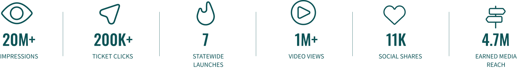
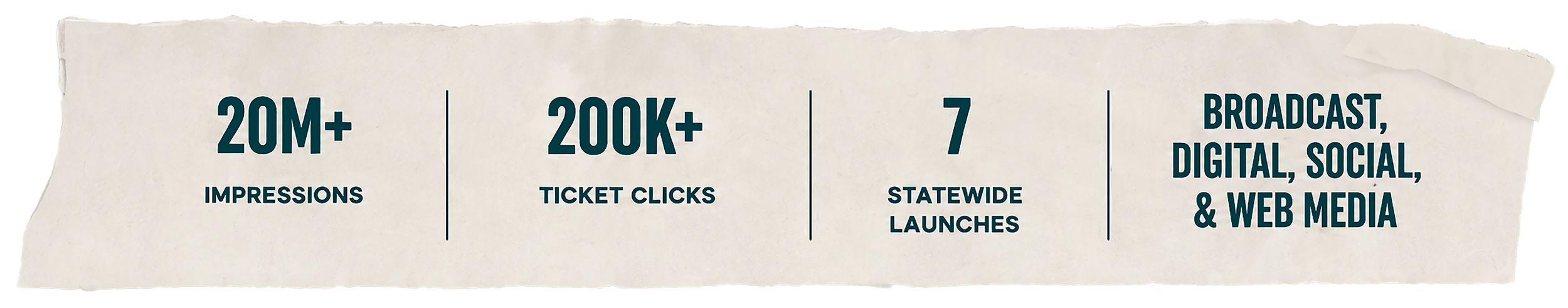
CAMPAIGN CASE STUDY
CLOSER
THAN YOU

Closer Than You Think™ was created to help rural Colorado students and families see college as something possible.
There were scholarships, grants, and funding opportunities available, but too many students, especially in rural communities, did not know how to find them or take the next step. College was not always as far away as it felt. The path just needed to be clearer.
The campaign needed to meet people where they were and make higher education feel more within reach. My job was to help build the visual world around that idea.
THE CHALLENGE
For a lot of rural students and families, college can feel distant before the conversation even starts.
The bigger challenge was bringing Colorado’s universities and colleges together around one shared message, then building a campaign that could reach rural communities with a limited budget and a timeline tied closely to the start of the school year.
We needed something versatile enough to move quickly across channels, but still thoughtful enough to feel personal.
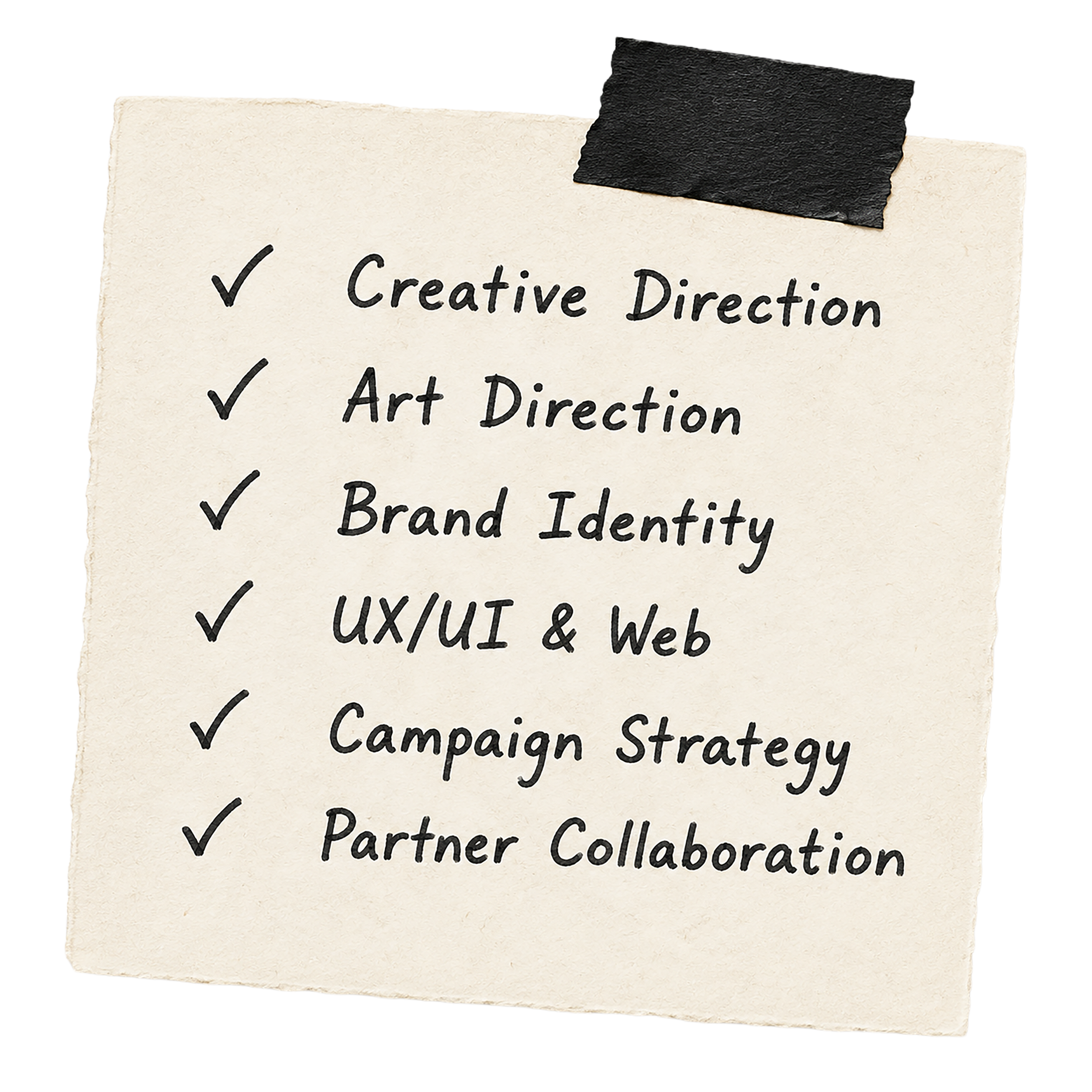
THE ROLE
I led the creative direction and design for this campaign from early concept through launch.
With multiple Colorado colleges and universities coming together around one message, the work needed to feel unified without becoming generic. I shaped the look, tone, art direction, campaign identity, website experience, and the way the system showed up across broadcast, digital, social, web, and partner materials.
Every decision came back to the same goal: make college feel closer, clearer, and more accessible for the students and families we were trying to reach.
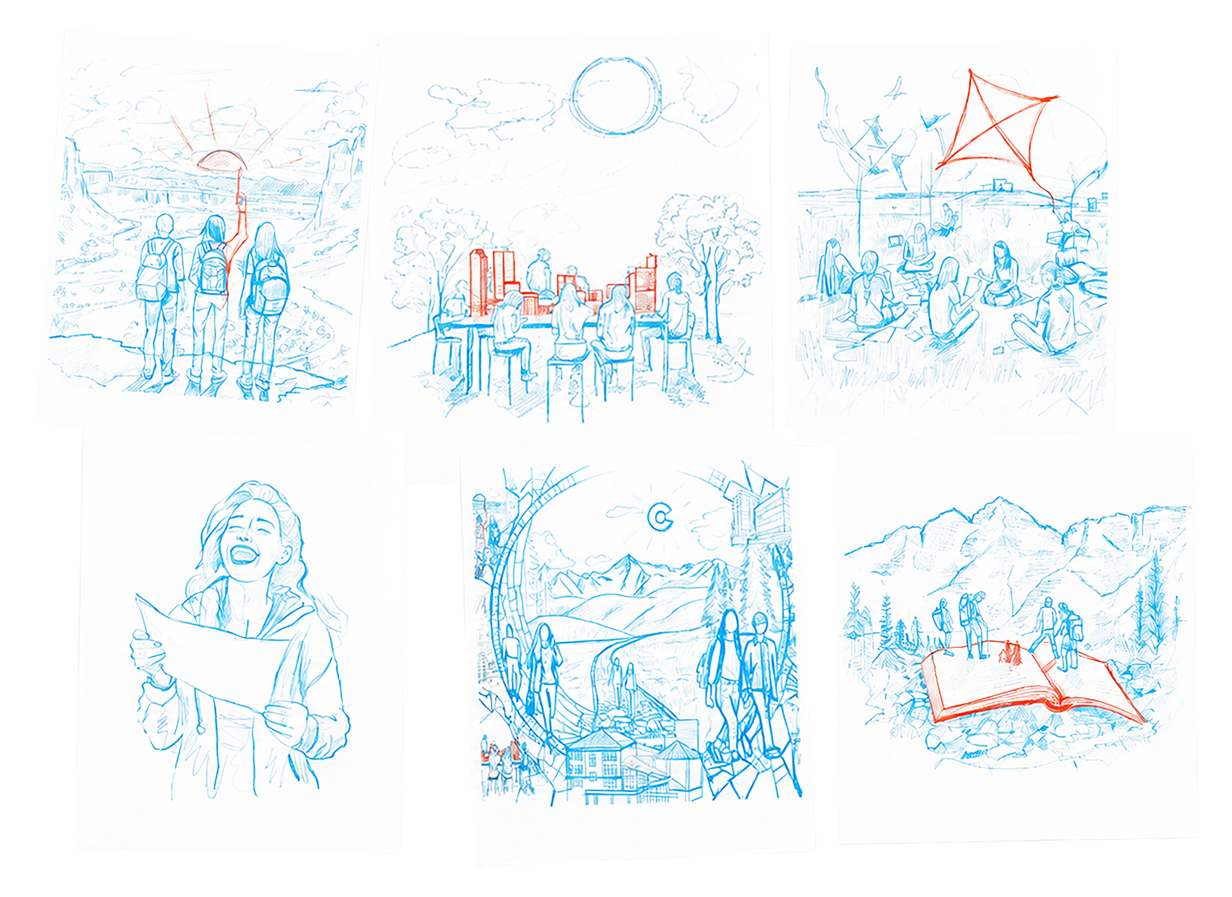
I started with the idea of a student’s journey.
The early sketches explored what that journey could feel like when it was rooted in Colorado: the landscapes, the communities, the campuses, the unknowns, and the moments of possibility along the way.
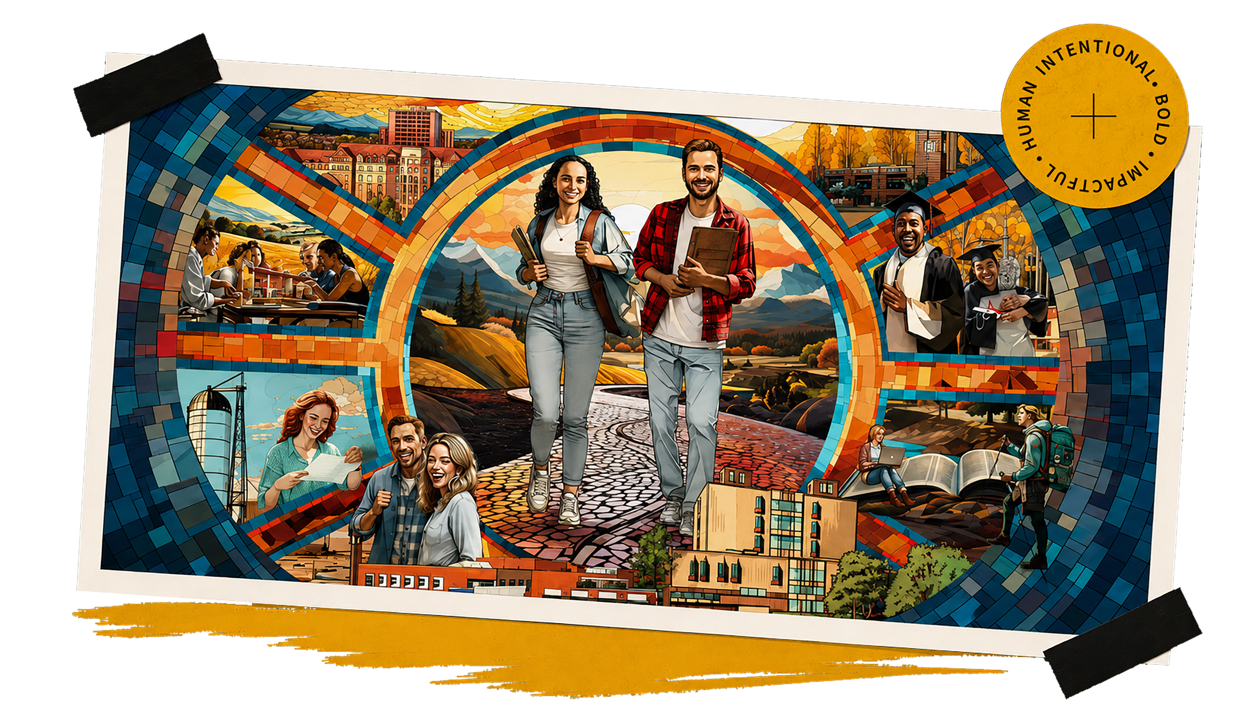
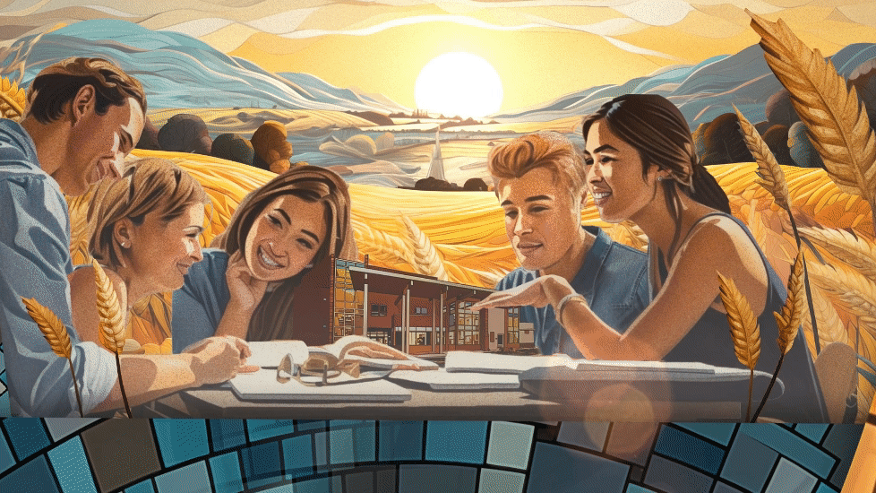
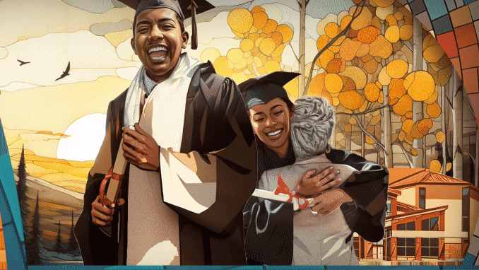
After a few rounds of concepting, we landed on a mural-inspired structure that could hold the bigger story. It gave us a way to show the path toward college, the doors it can open, and the joy and confidence that can come with the experience.
I didn’t want this to feel like generic college marketing. The campaign had to move quickly, stretch across a lot of different channels, and still feel personal at every touchpoint.
THE MOSAIC
A CENTRAL STORYTELLING DEVICE
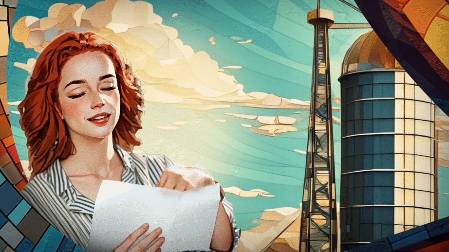
The mural became the heart of the campaign.
It had to do a lot of heavy lifting. It needed to work as one full campaign visual, animate across video, and break apart into smaller moments for the website, social, email, and digital ads.
We were speaking to both students and parents, so the mural had to hold both sides of the journey. For students, it showed the experience of college and the possibility it could open up. For parents, it helped speak to access, funding, and the reality that support was closer than they may have realized.
I built the mural around Colorado campuses, rural communities, and the students and families we were trying to reach. Every piece had a purpose.
It was not an easy system to solve, but it became one of the parts of the campaign I am most proud of.

When the mosaic moved into video, I wanted the animation to feel like we were guiding people through the story instead of simply showing artwork on screen.
The motion helped reveal different parts of the campaign world. It moved from big landscapes into more personal moments, giving the message a sense of warmth and discovery.
I created brand guidelines that helped define how the campaign should look, sound, and behave once it moved into the world.
The system gave our teams and creative partners a shared foundation. It protected the personality of the campaign while still leaving room for different audiences, placements, and phases.
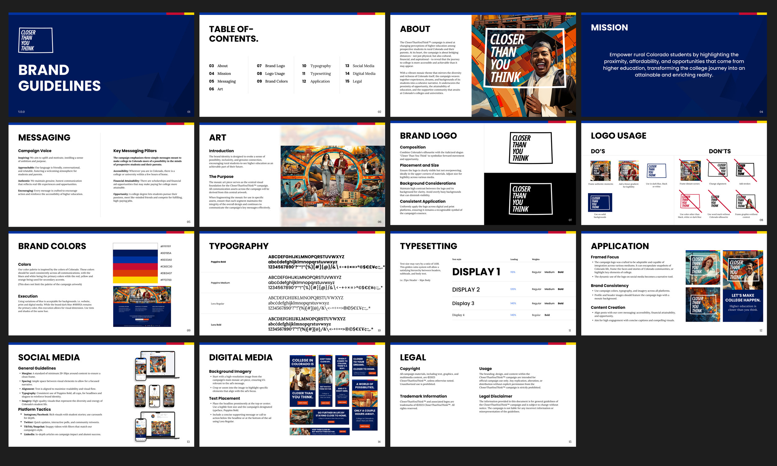
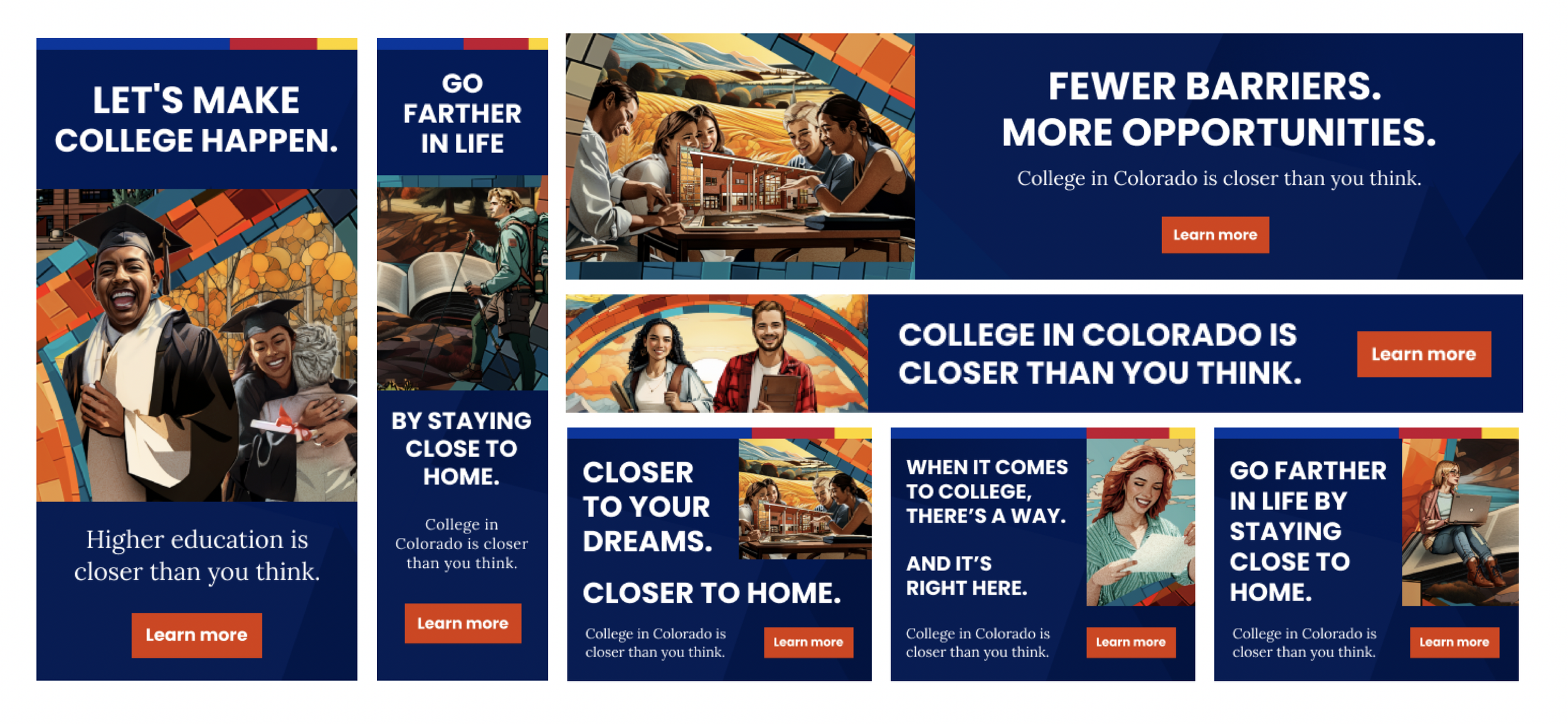

The mosaic gave us the world. The frame gave us the focus. Together, they created a flexible system that could move across paid media, organic content, social platforms, and community outreach.
Each asset had to catch attention quickly, but it also needed to make the next step feel clear. Whether someone was seeing a student message, a parent message, or a financial aid message, the design had to feel connected to the same larger story.
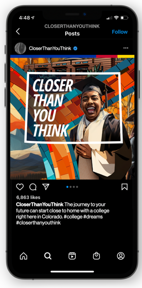
TURNING THE LOGO INTO A PERSONAL CONNECTION DEVICE
One of the most intentional parts of the campaign was the logo itself.
I created the Closer Than You Think™ mark in the shape of Colorado, with the words sitting inside the state and enough open space to frame real campaign moments. That space became more than a design choice. It gave us a way to place students, families, campuses, and moments of possibility directly inside the message.
The logo became a reminder that college was not somewhere far away or out of reach. It was already part of their world, closer than they may have realized.
Using the mark as a frame gave the campaign a simple visual device that could carry across social, digital ads, web, video, and partner materials while still feeling personal every time it showed up.

CloserThanYouThink.org was created as the digital home for the campaign during launch.
The site brought together school options, financial aid resources, contact paths, and next steps so students and families had a clearer place to begin.
Because the campaign was focused on access, the experience needed to feel simple and supportive on both desktop and mobile. The goal was to make the process feel less intimidating and help families see that college support was closer than they may have realized.